Saturday, 22 October 2016

Week 4: Homework

Drawing Your Hand Holding Different Household Objects

This homework was to continue work on foreshortening by drawing our hand holding 5 different objects. We were told the objects should all be different and to think about which angles and compositions we used. One line from the homework task that I tried to remember going through the task was :


'Make your drawing as exciting to you as it should be to the viewer.'

I felt that this was important because sometimes it's easy to forget the purpose of a drawing and get slack with composition and visual impact. 

The first drawing I did I didn't find too hard, and quite liked, but I felt it was a pretty standard pencil drawing without anything too special to make it stand out. I think this is because I was a bit cautious going into the task and was worrying about being able to get the drawings proportional because of how many issues I'd faced in class on Monday.

However, I decided to change tactic and ended up experimenting with a series of left hand drawings, which I straight away found a lot more visually exciting and not only that - but also exciting to draw! I really don't know what it is, but drawing with my left hand I find myself able to achieve much more accurate results. This was ideal for the hand drawings, as there are so many tricky angles, tones and forms within hands especially when holding objects, so the loose left-handed linework suits this perfectly. I ended up even going back and redrawing my first drawing in left hand, and when you compare the two it's clear which is more effective.

Having found this technique so inspiring, I even went back and redrew a self portrait using this technique, because from the start I hadn't been happy with my self portrait task. I was surprised and pleased with this result, which firstly I can relate to myself a lot more, and contains so much more character than my first attempts. It also finally feels like my work, as it's a style that I love to work in. I feel like I have now managed to make a self portrait that does my drawing justice, because before I just always felt like I could do better and be more unique with it.

I was happy with my left handed pencil drawings but for the homework task to be properly completed and for me to improve my skills, I wanted to add more than just pencil. I have left a couple of the drawings without much else, simply because I feel they are important as showing my studies of proportion and perspective, and my technical drawing skills. For many of the other hand studies however I added paint or tone or both. The first hand drawing I had made, which I felt was rather weak (and was done with my right hand) came to life when I chose to frame it with dark streaks of Indian ink. It makes the focal point of the hand holding the perfume bottle jump out at you from the page, and draws the eye to the areas of contrast.

30 MINS / INK AND 2B PENCIL
The next drawing has been left as pencil but I repeated the drawing multiple times so that the composition is overlaid and more visually interesting. I definitely think this drawing would benefit from some colour, but I am such a fan of the linework that it would be a real shame to cover it up! This may be an opportunity to go back and add fineliner or biro, so the lines aren't lost, but they are defined more clearly.

20 MINS / DRAWING WITH BOTH HANDS / 2B PENCIL
Next is my first paint study of a hand. I used goache and pencil for this piece, and built the goache up in layers to clearly show shadows and highlights. The colours I chose complement each other well, and I think on the whole the composition is successful. I'm a little disappointed with the background colour I chose, which looks very messy and doesn't reallt strengthen the image in any way. In fact, a few areas of the hand don;t stand out as much as I would like, and this could be down to the background. I also don't think I left enough space for highlights, which would have helped the hand look more 3D and less flat. I do really like the thumb area especially though, for I feel I managed to observe and capture its shape very well and the tone is nicely captured with the chosen colours.

40 MINS / COLOUR TONAL STUDY / GOACHE AND PENCIL
I used charcoal for the next study, and this therefore took me a little longer. I chose to draw my hand holding material as a challenge to myself, because I knew how many folds and tones would be created with this! The drawing came out much better than I expected and the charcoal lent itself nicely to the shadows, and because I was easily able to smudge it, it created good midtones. I left the white paper showing through for highlights. While I think the piece is strong, I do think the contrast needs further developing in order to bring the hand out from the rest of the drawing. Despite this, I'm happy with the accuracy of the hand and realistic appearance of the material.

40 MINS / CHARCOAL TONAL DRAWING
The next drawing took my the longest of all the homework tasks, because I used watercolour which require more patience and detailed brushstrokes. I chose to use this for the drawing as I knew watercolour would work well to create the shadow stretching out from under the hand, and I fancied trying paint again and improving with my layering. I found the watercolour nice to layer as it wasn't too opaque so different colours could show through each other. I worked with a palette based around one main colour - green, which gave the image a consistent and well-rounded feel, linking every tone together. One thing I notice now is that the drawing's composition could be stronger, as it is just coming onto the middle of the page from nowhere. This is maybe a drawing I should have done landscape. The background could be livened up or at least filled with a larger drawing. I'm going to try to stop resisting filling an entire page.

50 MINS / PENCIL AND WATERCOLOURS
Lastly, we have the drawing of the hand holding the perfume bottle which is redrawn from the first image. Now that I have added the ink the the first image, the drawings exist in very separate styles and I'm happy to have both of them to compare and analyse. I've left this image pencil as well because I think it's my strongest of all the hand drawings, the proportions and perspective are all correct and the hand has a sense of life about it. I don't want to lose this lightness by adding anything more heavy to it. I think it is important sometimes to know when to stop with a drawing so that it's most effective, and for me the drawing is often most useful when I can study the outline and how its been drawn.

15 MINS / LEFT HANDED DRAWING / 4H PENCIL
This exercise was definitely a challenge but a lot of fun, and I enjoyed experimenting with medium, composition and perspective as I went along. I feel that every drawing I make helps me understand more!

Wednesday, 19 October 2016

Week 4: Foreshortening

This week we were looking at foreshortening, which is an area of perspective that is particularly difficult and I was looking forward to learning more about it and how to deal with it in drawings.

This was definitely the hardest week of life drawing so far. I struggled with all of the drawings, and while I know that making mistakes and learning is the process of improvement, it was hard not to get frustrated with the outcomes which I knew weren't my best work. Even so, there are positive elements within the images and I need to remain optimistic and see this as the beginning of better drawings!

For the first pose, the model was sitting sideways to us, so there wasn't really any foreshortening. This meant it was quite nice warm up, and I was able to re-practice techniques we'd learnt in previous weeks, such as measuring and sizing. I think the piece turned out okay. There are a few proportion issues, and the lines are a bit sketchy without much tone or boldness, but on the whole the composition sits nicely on the page and I think the sizing of the figure isn't too bad. I think with more development and re-measuring this would have turned out to be a good piece.

45 MINS / 6B PENCIL
Pose 2 was a huge change, as my angle went from no foreshortening to being directly faced by the model. As she was lying down, the entire body was foreshortened, and so it took me almost all of the 45 minutes to measure and draw the outline. You can see on the page that I had to rub out many times, although I'm not too worried about these lines being visible as it's interesting to look back and see mistakes and improvements. I'm still not very happy with the drawing, because I don't feel like I achieved an accurate perspective despite spending so much time working on it, which is frustrating. The sizing seems okay, with the head clearly 'closer' to the viewer than the bum and feet, but the whole position looks a bit off. I think what would have helped is some tonal shading to add depth, as well as if I'd had time to draw in some of the background, so she was actually lying on something. This would have shown the background also receding from the viewer, helping to give the same illusion to the body.

45 MINS / 6B PENCIL
The studies were all pretty intense with each lasting for 45 minutes straight, and as I found them harder my focus and motivation began to slip, which is clear in drawing number 3. I think what didn't help is that I had another really difficult pose directly after number 2 which was also very hard. I had never drawn the body from this angle before so had to rely directly on my eyes, and found it tough not to get carried away by my brain telling me to draw what it thought the body should look like. The composition also isn't great, and the leg appears a little squashed on the page which doesn't help with the already compacted pose. Trying to look at positive areas, I am pleased with the arm tucked behind the back, where I think I achieved the position of the fingers quite well. The head and shoulders do definitely appear smaller than the hips and legs, so I think my sizing is improving as I go, but I think it's just the angles and perspective that are letting me down. I have begun to add a bit of background context, however, which helps a little.

45 MINS / 2B PENCIL
Drawing 4 surprisingly is my favourite of the 4, despite me being tired and irritated with myself by this point. The pose was much easier to draw; although there was still lots of foreshortening the pose was more open and elongated, so I could see the angles and perspective that I needed to draw a lot more clearly. I used more background context here so the composition is stronger due to the eyes being drawn backwards into the image along with the figure. The proportions are still not perfect, but you can clearly see the figure is meant to be reclining. The one thing that I'm upset with about this drawing is that I attempted to add facial detail. Looking back this was not a good choice but the model had such an interesting and distorted expression from this angle that I was inclined to capture it. I don't think I achieved it very well and it doesn't work well with the rest of the drawing. Because I used a dark pencil, the face still shows after being erased, so this bothers me in what would otherwise be a mostly successful piece!

30 MINS / 6B PENCIL
SAME 30 MIN STUDY WITH TAPE COVERING FACE - IMAGE BECOMES STRONGER
I have lots to come away with and think about from this session. I think that after having some time to accept my mistakes and see the positives in them, I will feel happier about practising this again!


Saturday, 15 October 2016

Week 3: Homework

The Still Life Self-Portrait

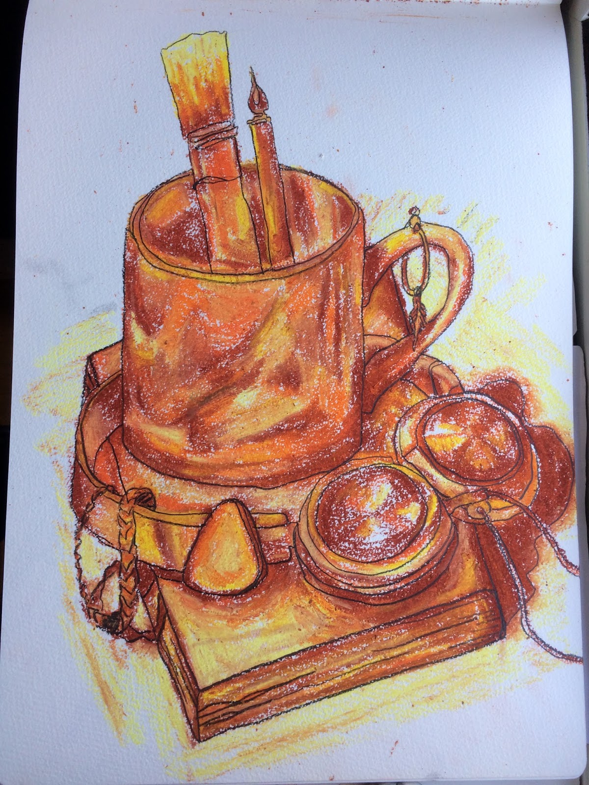
This week's homework was to create a still life of items that represented us as a person - our personality, thoughts and feelings at the time, personal objects, etc. We then had to make 3 drawings of the scene, using line, tone, and then a mix of both.

Setting up the still life was enjoyable as you had to think about which objects you would be interested to draw, and how the composition would look on the page. The arrangement of objects would also have an effect on the impact of the final drawing so I spent a little while moving, rearranging and studying my still life.

Once I was happy with it, I began the drawings. The first was a continuous line drawing, and we had to try to look at our drawing as little as possible. I thought this would be harder than I actually found it, so I was pleasantly surprised. I thought that having to keep the pencil/pen on the page would make it difficult to get proportions and perspective correct, but in actual fact I found it easier as you couldn't really be too fussy about it, so had to just trust your eye and focus on what you could really see. The continuous line also gave some interesting layering effects when it crossed objects over one another. I was able to bring some experience from the previous homework into the task, by looking at the negative space to improve the accuracy of the drawing.


Next we had to produce the same drawing using only tone, in a variety of pencils, so I chose 2B, 4B and 6B. The 6B worked very well for the darkest areas while the 2B let me add some nice mid-tones. This was another exercise that I expected to find hard, because sometimes when defining an object only using tone it is easy to lose proportions. Although it was challenging, and required lots of double checking, I found the exercise a lot of fun and am pleased with my outcome! I tried to use as little outlining as possible so that it really was the tone that defined the objects, and only used line for really straight edges such as on the book. The tone makes the drawing jump from the page and is successful at creating a 3D illusion.


The final drawing was combined tonal and line drawing, and I chose to use coloured oil pastels as they're not something I often use but I felt the vivid colour and texture would lend itself nicely to the task. This is the drawing I am probably happiest with, because I think I'd got my confidence up by this point and was a lot bolder with my mark making which shows in the end result. The colours I chose work really nicely together and I think that I captured the highlights and shadows pretty effectively. I started out with tone as suggested, and then defined the outlines more later on with heavier oil pastel and continuous pencil line, which I find successful in breaking up areas of tone and giving a stark contrast.


I found this exercise great at improving observational skills, and working on perspective and proportion using negative space, as well as continuing our studies of tone and line. One thing that I still think I need to work on is my composition, as the images still remain in corners or sides of the page and especially with the line drawing, can get a little lost, which lessens the impact of the image.

Wednesday, 12 October 2016

Week 3: Proportion

As identified through previous exercises, proportion can be one of my biggest weaknesses, so I was both excited and apprehensive coming into this week's class. However I knew it was important in order to improve, and I had to stop being nervous of producing 'bad' drawings!!

We began by looking at measuring techniques for drawing proportions correctly. This was something I remembered from previous life drawing classes, but hearing it again was helpful at refreshing it in my mind and applying it to the current model. Measuring the head size on a pen or pencil, with one eye closed, could then be translated to your paper in relation the size of the head you drew. You could use the pencil to measure the number of heads tall the body was, and then again translate that to your paper using the size of the head you've drawn.

Throughout the session this was very useful in many ways, one of the most obvious for me being the positioning of the figure on the page. The first two drawings are slightly off centre but you can see in the later three that the figure becomes very centralised, which is an improvement from last week's session! It also helped me with sizing different parts of the body in relation to one another, although this was definitely not 100% successful especially in the early drawings but kept me learning as I went through.

30 MINS / 4H PENCIL 
30 MINS / CHARCOAL
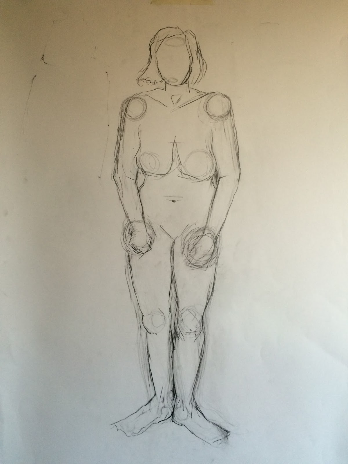
Later I began to learn that drawing circular shapes and lines across the figure helped me in visualising the positions and angles of joints and planes of the body, and resulted in more realistic and balanced posture. The posture in my early drawings can be seen as somewhat lopsided, as one issue I found was drawing the way the weight was balanced in the stance. Therefore the figure sometimes looks like it is leaning. I am pleased that looking through the drawings a clear improvement can be seen between the first two drawings, which were 30 minutes, and my final 1 hour study. All but one of the drawings are standing poses, but it is only the final one which achieves a balanced posture, which demonstrates what I identified as an issue and worked on improving during the class.

FIRST ATTEMPT AT THIS 30 MIN POSE // RESTARTED DRAWING

SECOND ATTEMPT AT 30 MIN POSE / 4H PENCIL
I STILL THINK THIS TORSO IS MOST SUCCESSFUL, BUT THE LEGS LET IT DOWN
 The final drawing also seems to be the most accurate in its proportions, and although I still have some work to do I am a lot more confident going into week 4 having seen some progress.

1 HOUR TOTAL / 3B PENCIL

Saturday, 8 October 2016

Week 2: Homework

Drawing Household Objects in Negative Space

This week's homework was to draw several household objects using negative space rather than the actual outline of the item itself. This was intended to really help you study the form of the object and only add tone for later 3D effect. Looking at negative space also helps with getting the proportions of an object correct.

The 4 objects I chose were: a bottle, a mug, a cactus and a pair of earphones. I was a little limited with what I could choose as I live in halls, but I tried to make my objects varied in shape and size.

I found the task challenging at first but once I trained myself to look mainly at the negative space and not draw the object itself, it got a lot easier. I immediately found that my objects became a lot more proportionally accurate so therefore appeared more realistic and solid. Once I had got the basic outline down using negative space, I went in and added tone and background details so that the objects did not look as if they were floating! The tone was another challenge, to capture the light on the object and make it look 3D.

I am pleased with all of my drawings which I feel do appear mostly quite realistic and proportional, as this is something I've identified as a weakness. I tried hard not to overwork the tone and make them too heavy, and I think I achieved this as they still hold a clear boldness without getting lost in shading. I do think perhaps I could have used less tone to keep the focus more on the negative space outline, although I don't think it makes the images weaker -  just not quite as minimalist as I intended. For example, in the drawing of the headphones you can see the negative space is more apparent which is considerably more striking.


I also set myself challenges with my arrangement of objects, so I feel I learnt more about perspective and depth through this homework. One of the weaker aspects could be my composition of the drawings on the pages, which I maybe could have thought about a little more deeply. As I went on this improved slightly but there is still blank space around each image which makes the drawing look a little lost on the page. In future I will remember this and try to fill the page more, or at least make the placement more effective.

Wednesday, 5 October 2016

Week 2: Intro to Life Drawing

In this session it was our first opportunity having a live model to work from. We looked at using a wide range of media and continuing to experiment with techniques from the last session as well as new ones, to create drawings and compositions that were exciting and visually interesting. I have done life drawing before, and found it extremely fun and useful, so I was excited to have another chance to take part. The session was very intense as we produced a lot of drawings in the four hour time slot - which was a good challenge, but did mean towards the end I was finding it harder to stay focused and this can be seen in some of the later drawings, where my proportions are less accurate. Despite this, I feel that it's useful to see these imperfections and be able to learn from them, and I am sure that as the weeks go on my ability to stay focused for longer periods will improve, as well as my skills with proportion.

15 MINS / SEMI BLIND CONT. LINE / 4B PENCIL
15 MINS / BLIND CONT. CONTOUR / CHARCOAL

30 MINS / CHARCOAL
This week also gave me an excellent opportunity to apply the techniques we learnt last week to a full body drawing and different mediums. Looking back through my drawings, I can see that some are stromger than others - for example, I really like the set of 3 speed drawings, which I feel are on the whole mostly proportionate and well arranged on the page. It was a useful exercise, thinking about how to place the drawings for the best composition. Last week I identified that my faster drawings were more successful, and I can see this reflected again in my speed drawings here. Another drawing I find successful from this week is my left hand drawing, using charcoal, because the loose lines gives the image a subtle and textured feel, and the tones are brought forward nicely.

20 MIN (CENTRE), 10 MIN (RIGHT) AND 5 MIN (LEFT) / SERIES OF 3 SPEED DRAWINGS / 4B PENCIL

5 MINS / CLOSE UP SPEED DRAWING

20 MINS /  CLOSE UP SPEED DRAWING

10 MINS / CLOSE UP SPEED DRAWING

10 MINS / CHARCOAL DRAWING
Other drawings are less successful, such as my blind contour drawing, which I feel sadly became overworked. This is because we had 30 minutes for this drawing, and due to my habit of working fast I feel I rushed the drawing and then was left with lots of time to spare, during which I continued to go back over original lines and add more tone. This shows me that for different techniques my better results may come from taking more time, and knowing when to stop adding to an image. I was a bit disappointed as I feel that this is a very original and interesting technique, but I can see some elements of the drawing which have been successful and I am looking forward to improving with the technique in the future.


10 MINS / BLIND CONTOUR DRAWING / 3B & 6B PENCILS
The tendency to overwork is also obvious in my last drawing, where we had to use 3 mediums, and also in the face of the double handed drawing. The body of this drawing is much more effective as the form is only loosely implied and not fully sketched out. This is therefore something I will watch for in future classes.

20 MINS / NON-DOMINANT HAND DRAWING / BRUSH PEN & 4B PENCIL
20 MINS / NON-DOMINANT HAND CLOSE UP / BRUSH PEN & 4B PENCIL

30 MINS / TONAL STUDY / MIXED MEDIA / BRUSH PEN, 4B PENCIL, 6B PENCIL, CHARCOAL

Saturday, 1 October 2016

Week 1: Homework

PART 1

The first part of the homework was creating this blog to share our thoughts and reflections on the week's class and our work. I think this will be useful for looking back on and comparing work I have done, and seeing what I have learnt.

PART 2

The second part of the homework is to draw a self portrait in any medium we would like. My portraits probably took me around 30-40 minutes each. I found this homework very hard because as stated in my last post, I find drawing to get a likeness very hard; even more so when it's my own face! I can be quite a perfectionist with my work, so having drawings that I'm unhappy with can be very frustrating and disheartening. Despite this, I know it is important to experience this in order to learn and improve, so I tried not to let it bother me too much. I'm still uploading the results because I know that there is lots these can teach me in the future when I'm looking back at them. 

I made two portraits because I wanted to try a couple of angles and techniques, and I think this was a good idea because both turned out very differently and have individual good and bad points! The first one I drew using my left hand because I really enjoyed that exercise in the ice breaker session, and I liked the slightly wonky and loose results it created. The drawing turned out pretty nicely, although it doesn't look too much like me. I used scribbling to create tone which works well with the sketchy style of linework too. Because I was using my non dominant hand I couldn't apply too much pressure with the shading, but I think this is beneficial as it didn't get overworked and remains subtle. The softer tones of pencil suits the expression I chose to capture, looking serious and perhaps a little lost or melancholy. I think to develop the piece further I could maybe have worked more into the background or clothing, and maybe included colour, but I captured so much expression and tone in the face that I wanted it to remain the focal point and was scared of losing it by adding more. Experimenting is an important process however, so I may try and step out of my comfort zone and work into this again at a later date.


40 MINS / 4B PENCIL
This next portrait is one I did in my own time just to experiment with drawing style and likeness. I again used my left hand and this time didn't add any tone or other mediums. I wanted to leave it as a line drawing to focus on the subject and hide the linework. I think I managed to capture a better likeness with this portrait and improved on my proportions.
35 MINS / 4H PENCIL
For the second portrait I created a more intense contrast by using pencil along with a dip pen and black Indian ink. The reason I repeated the medium of pencil is that as this was my first exercise I was still somewhat tentative. The ink was really fun to apply over the top and once again I kept it very loose and fluid, which brings a slightly dreamlike effect to the drawing, matching the thoughtful expression on my face. I can see that I'm learning to relate medium choice to the image, as I feel I was successful with this in both my portraits! Something I would like to try in the future is revisiting these portraits with colour and seeing if I can relate this to the subject matter as well. Once again, this portrait doesn't look much like me, but I'm not too worried about this at the current stage, as it's more about experimentation and the process of creating the drawing itself. I enjoyed the challenge of this task.

45 MINS / 4B PENCIL, INDIAN INK & DIP PEN